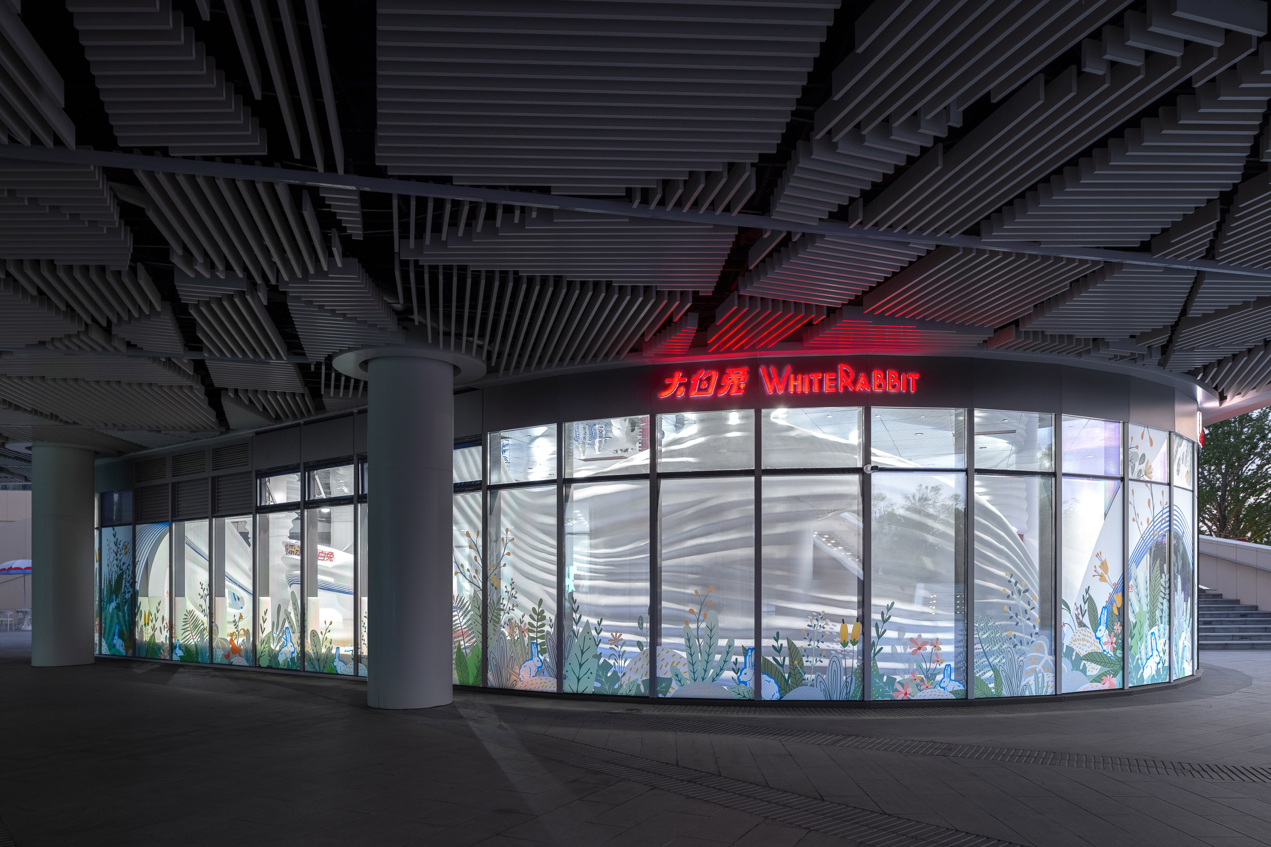
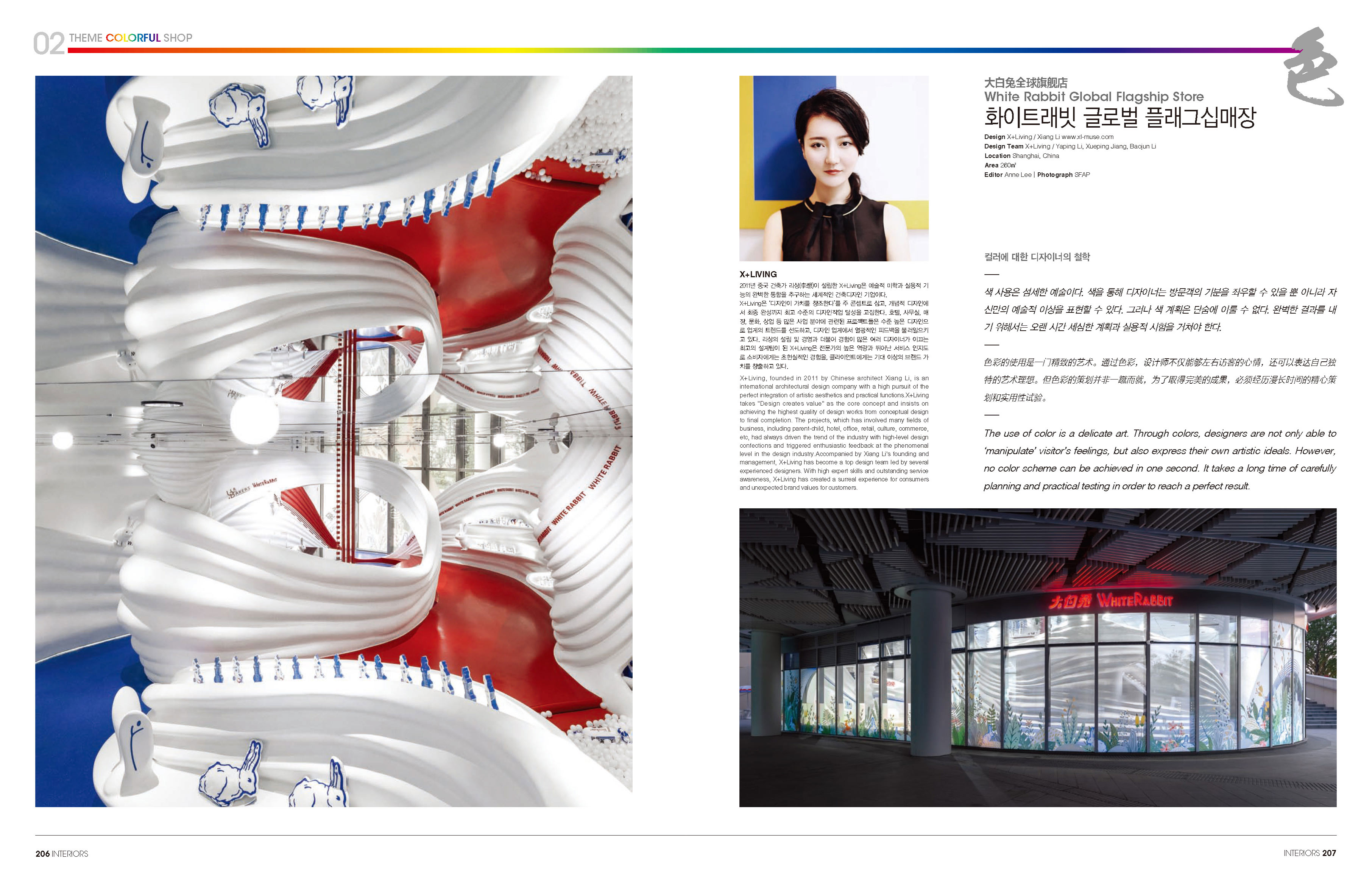
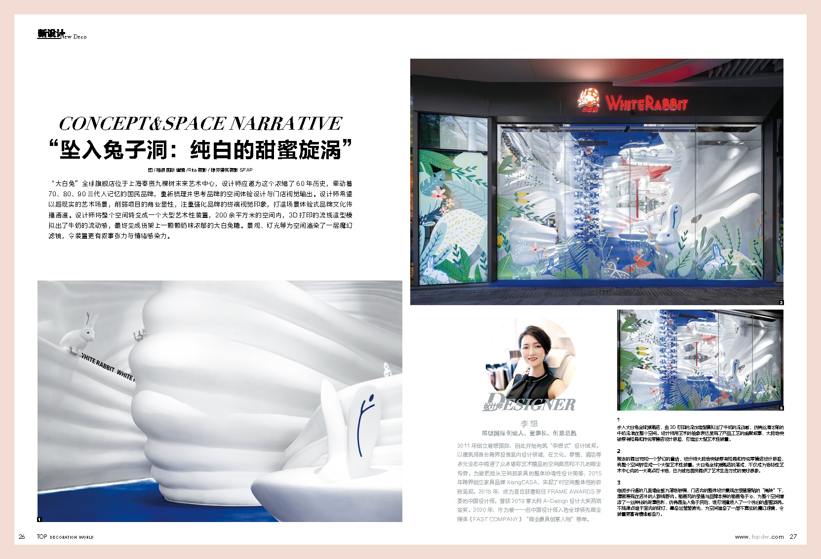
The White Rabbit Global Flagship Store locates at the JKS Arts and Cultural Center, famed as “the first forest theater” in Fengxian district of Shanghai. The designer was invited to reorganize and rethink the spatial experience and visual design for this national brand with 60 years of history, connecting memories of three generation ranging from the 1970s, 1980s to the 1990s.
As a long-established brand, White Rabbit has been adhering to its business philosophy of embracing constant changes in line with the rapid development of modern business. While maintaining good memories and keeping pace with the times, White Rabbit, titled as “guochao”, or Chinese fad, has forged numerous cross-border cooperation recent years. All these efforts have prompted its successful transformation. And, this triggered the designer’s thinking.
The designer hopes to weaken the commercial conspicuousness of the project with a surreal artistic scene, focusing on strengthening the terminal visual impression of the brand and creating a brand culture communication channel with scenario-based experience. This newborn global flagship store will preserve the essence of the brand, which has lasted for more than half a century, while reflecting the brand spirit and novel attitude of continuous breakthrough and creative integration.
This is also in line with the business vision of the Arts Center where the project is located - to create an art center for the future. The completion of the project will not only make the flagship store a major attraction in the landmark art center, but also provide citizens with a beautiful imagination of the future artistic lifestyle in the community.
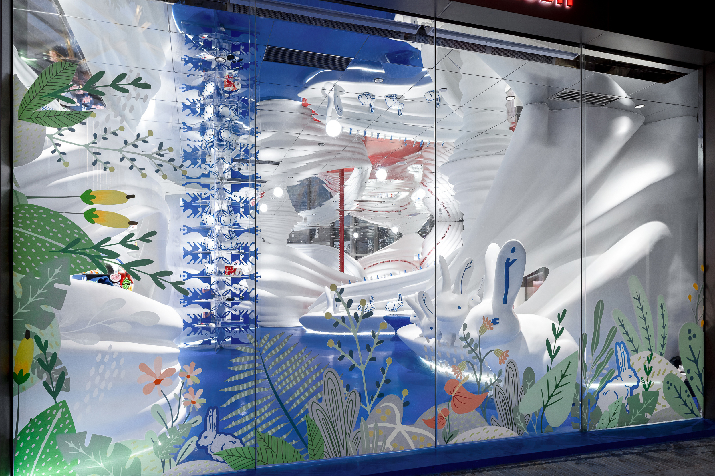
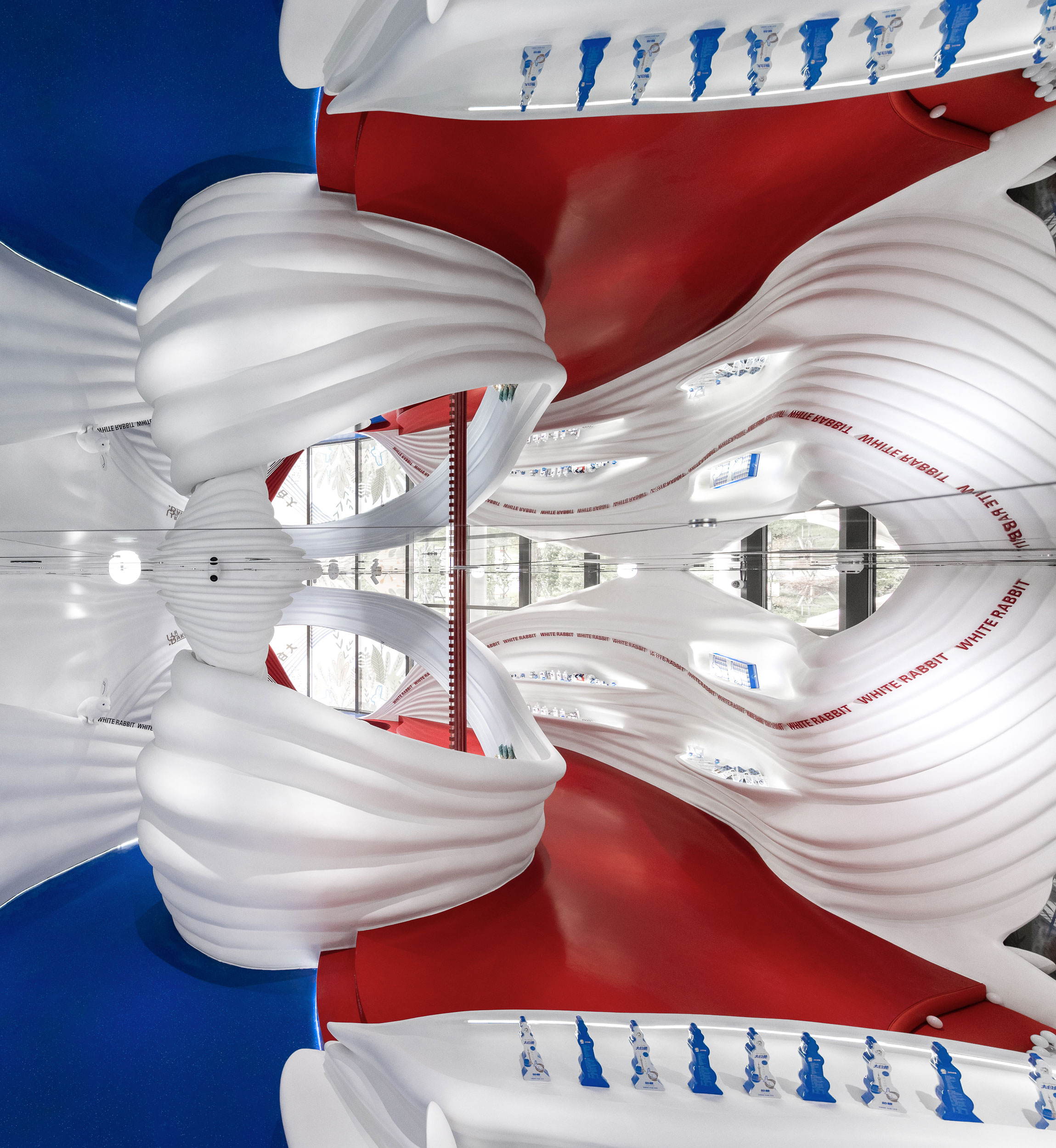
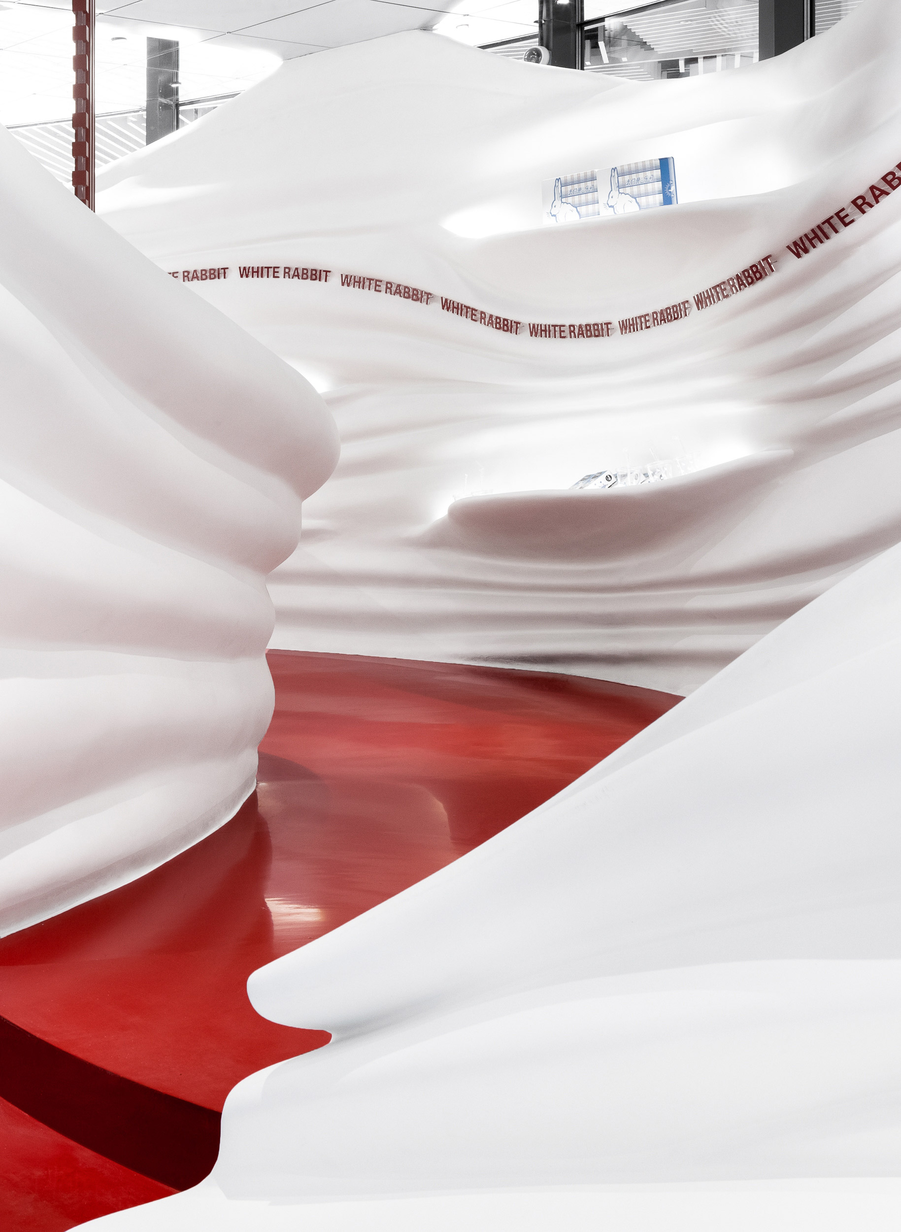
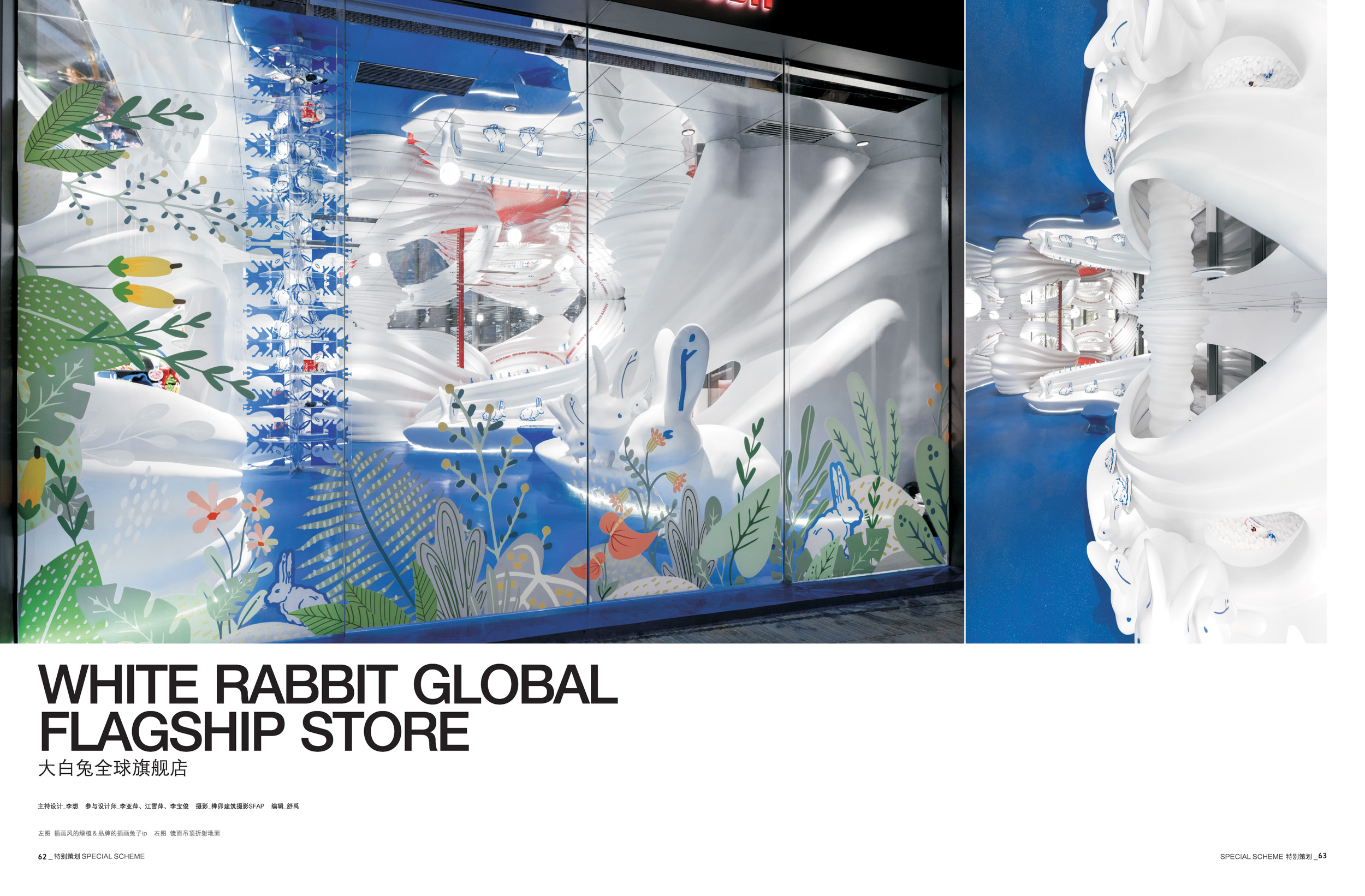
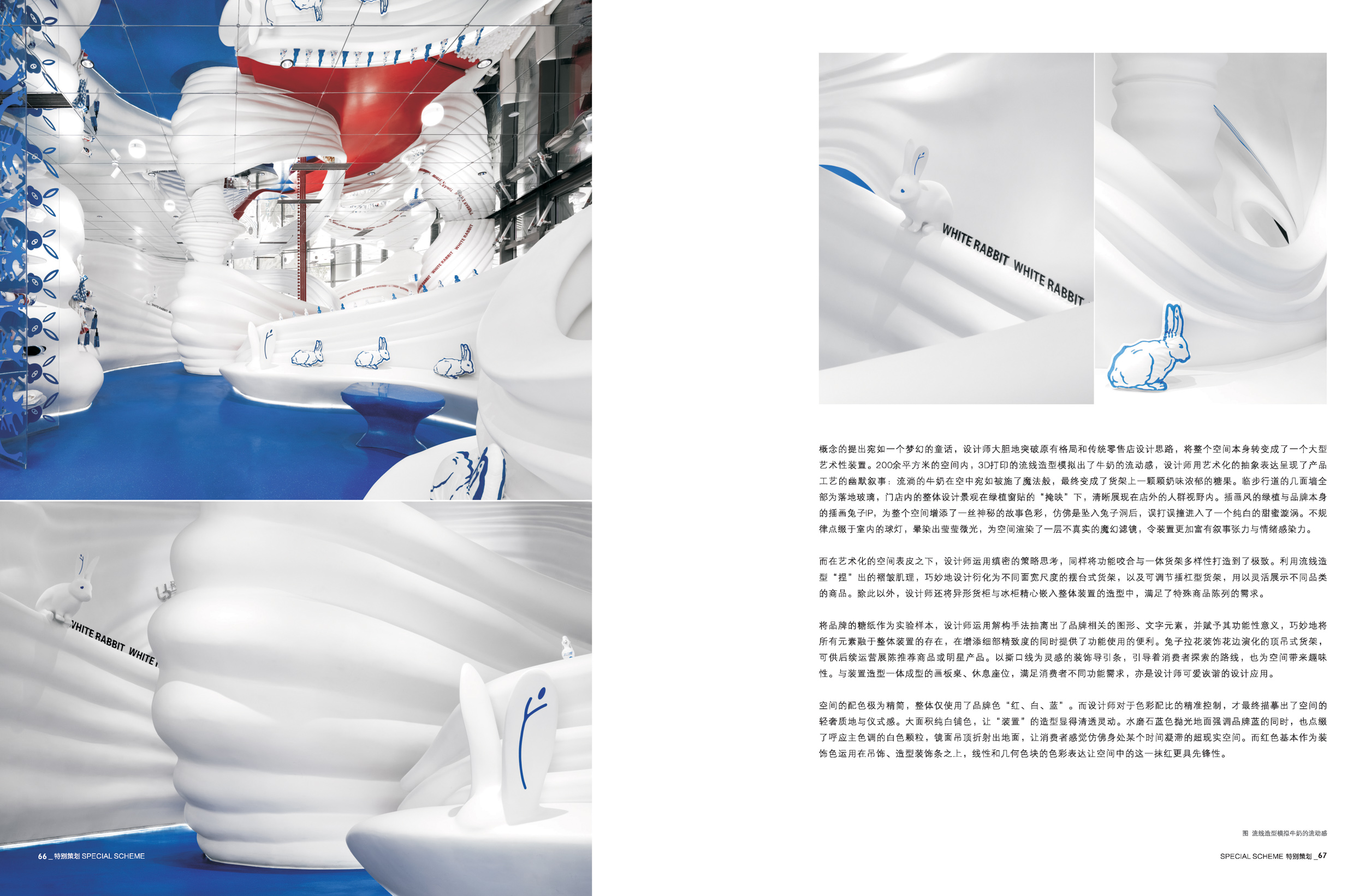
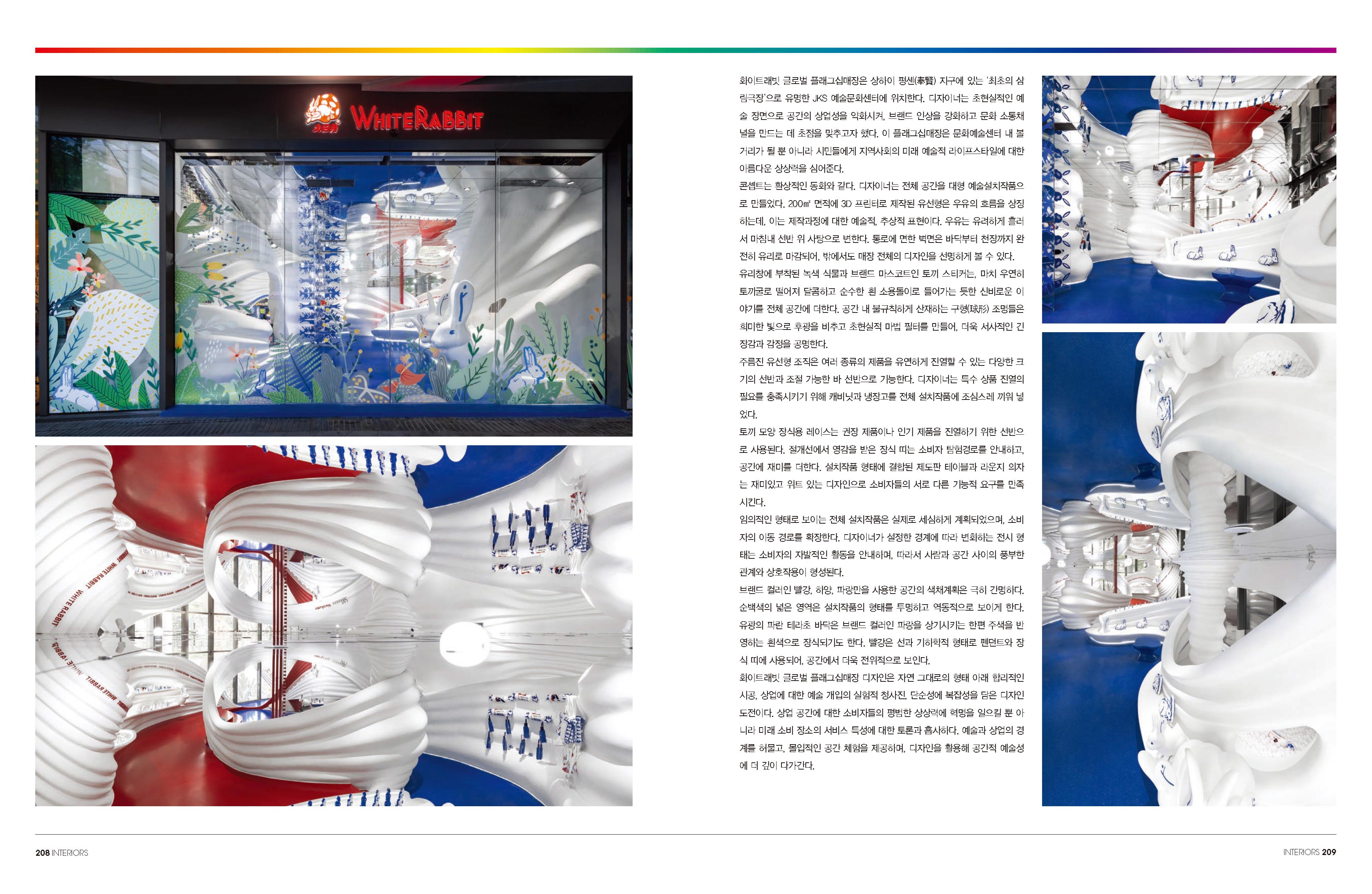
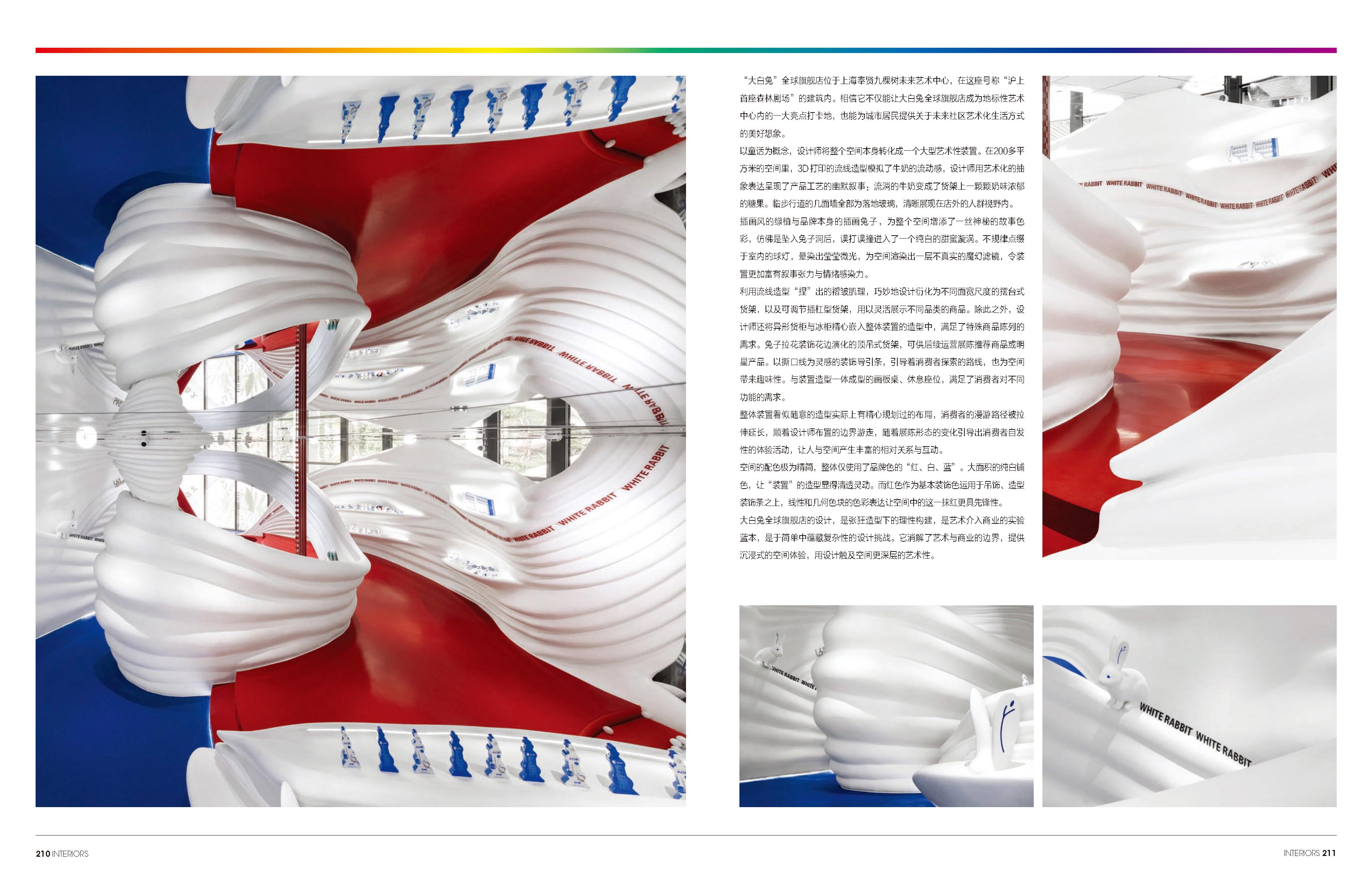
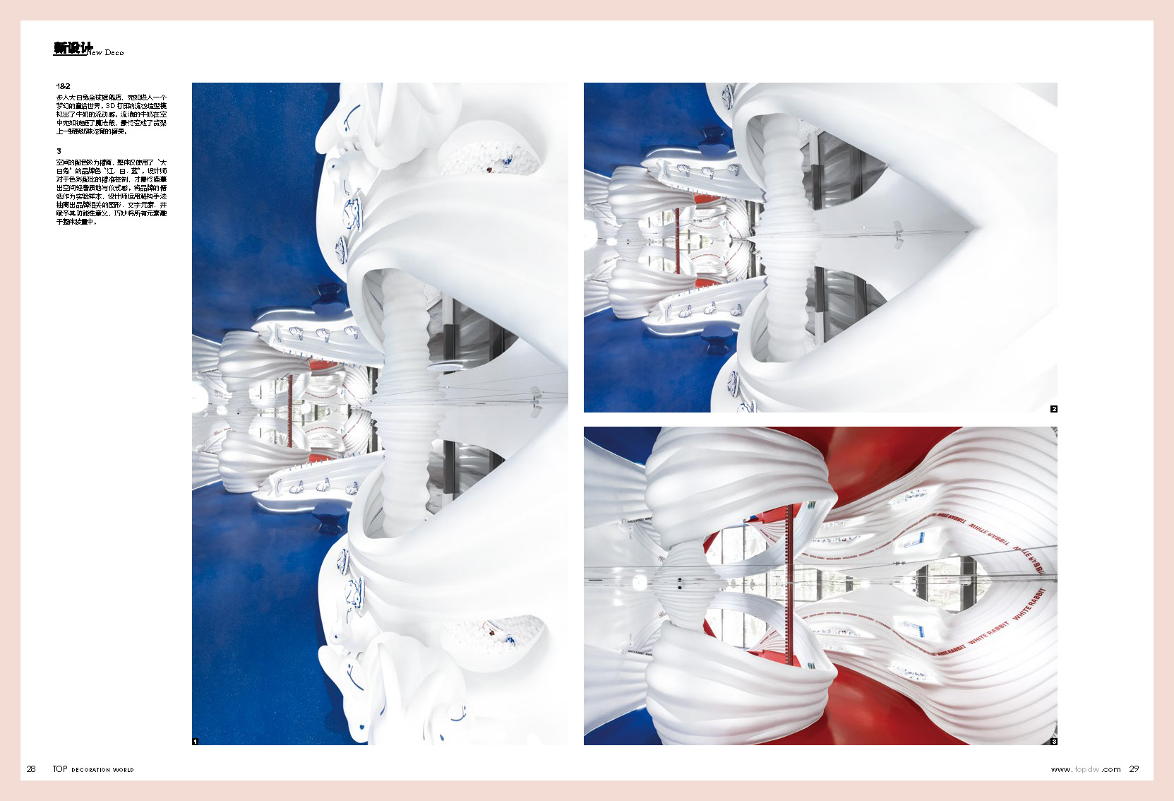
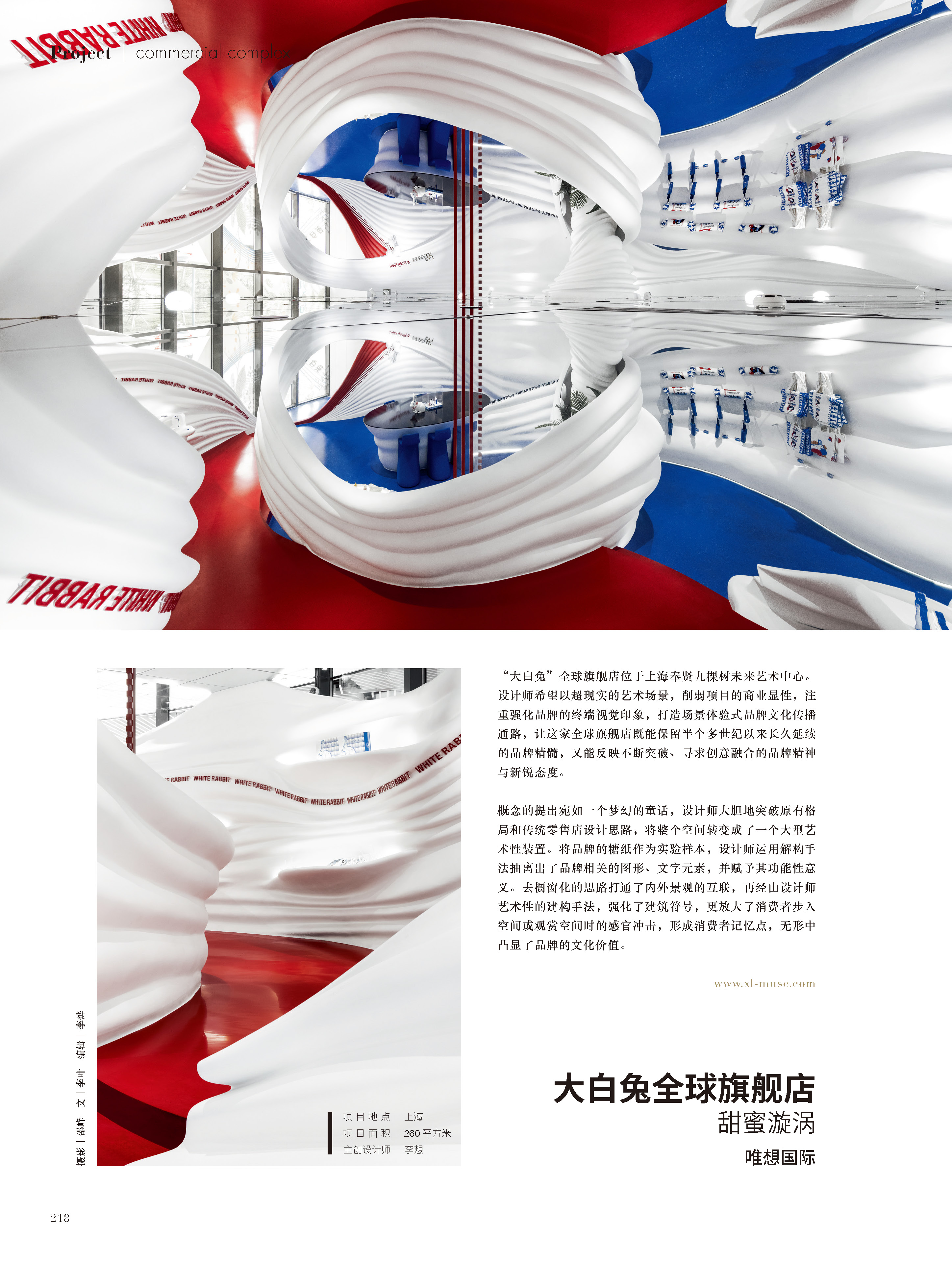
The concept is like a dreamy fairy tale. The designer boldly breaks through the original layout and traditional retail store design ideas, turning the entire space into a large artistic installation. Within the 200 square meters space, the 3D-printed streamline shape simulates the flow of milk, which is an artistic abstract expression to humorously narrate the production process: the seemingly enchanted flowing milk in the air eventually turns into creamy candies on the shelf. The walls facing the walkway are all floor-to-ceiling glass, so that overall design of the store is clearly visible to people outside the store. The illustration-style green plants and the brand mascot rabbit on the window sticker adds a touch of mysterious storytelling to the whole space, as if falling down a rabbit hole and entering a sweet and pure white whirlpool by accident. The spherical lights dotted irregularly in the room, haloed with a shimmering light, and rendered a surreal magic filter for the space, producing more narrative tension and emotion resonance.
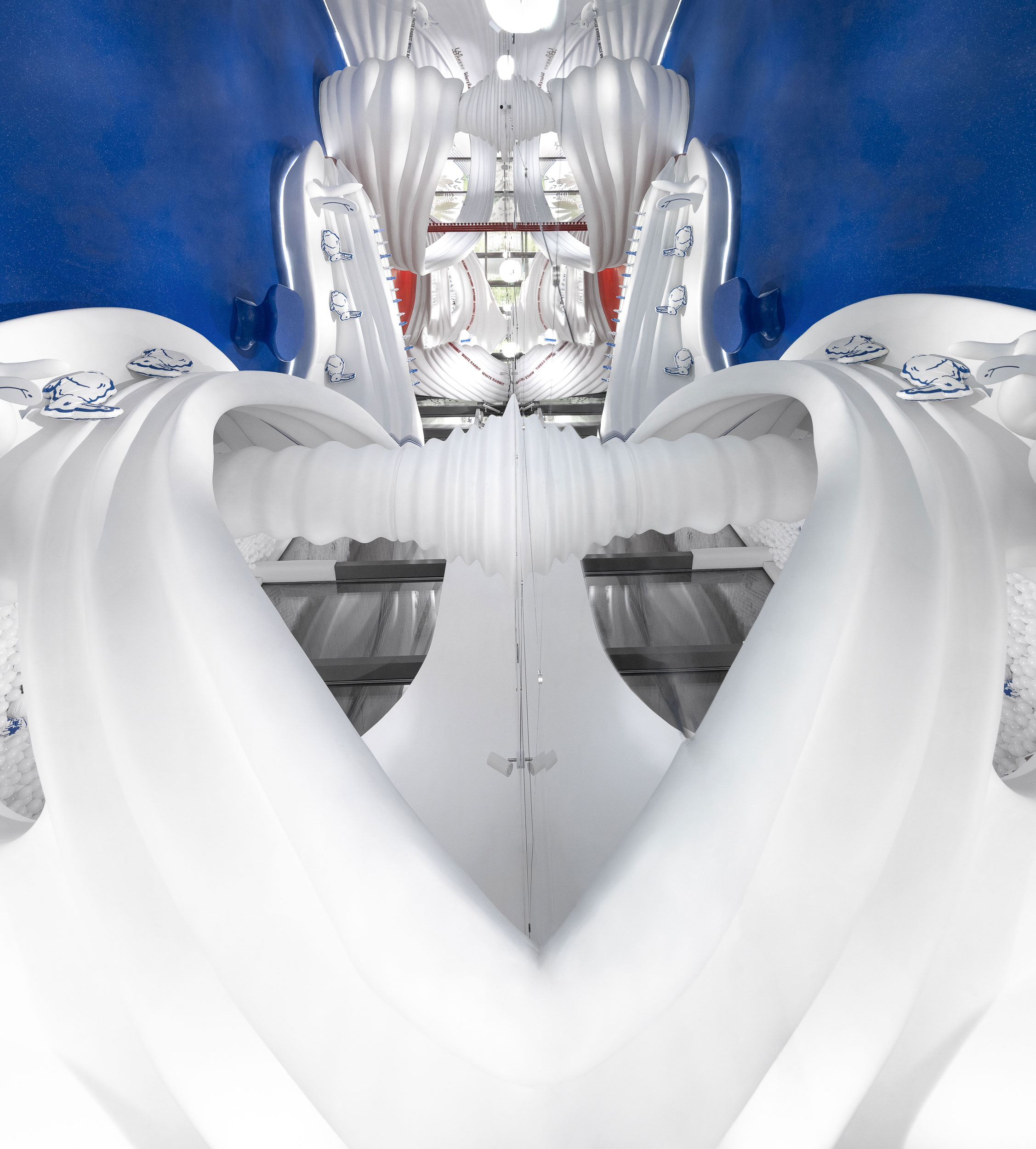
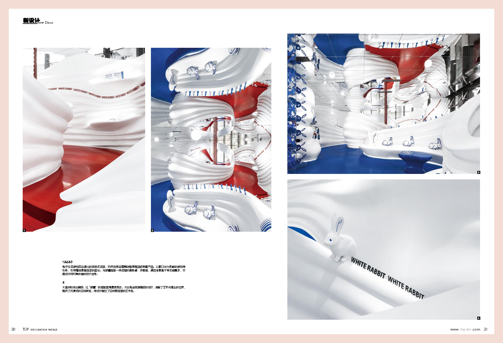
Behind the artistic space, the designer also uses meticulous strategic thinking to make it the best in function integration and diversity of multifunctional shelves. The pleated texture “pinched” using streamline shape is cleverly evolved into different sizes of shelves and adjustable bar shelves to flexibly display different types of products. In addition, the designer also carefully embeds shaped cabinets and freezers into the overall installation to meet the needs of special merchandise display.
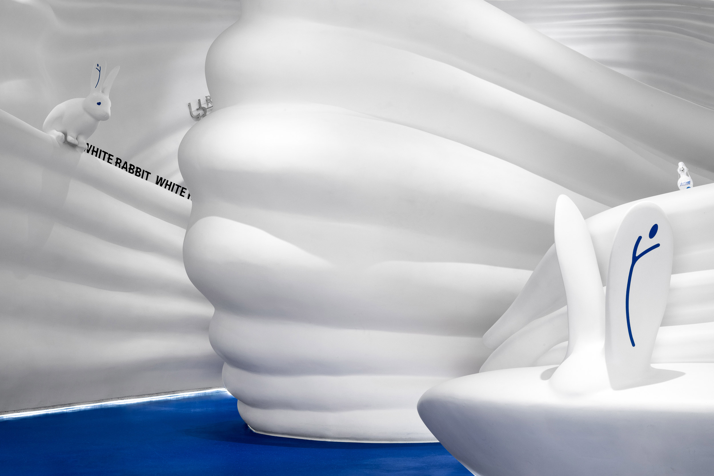
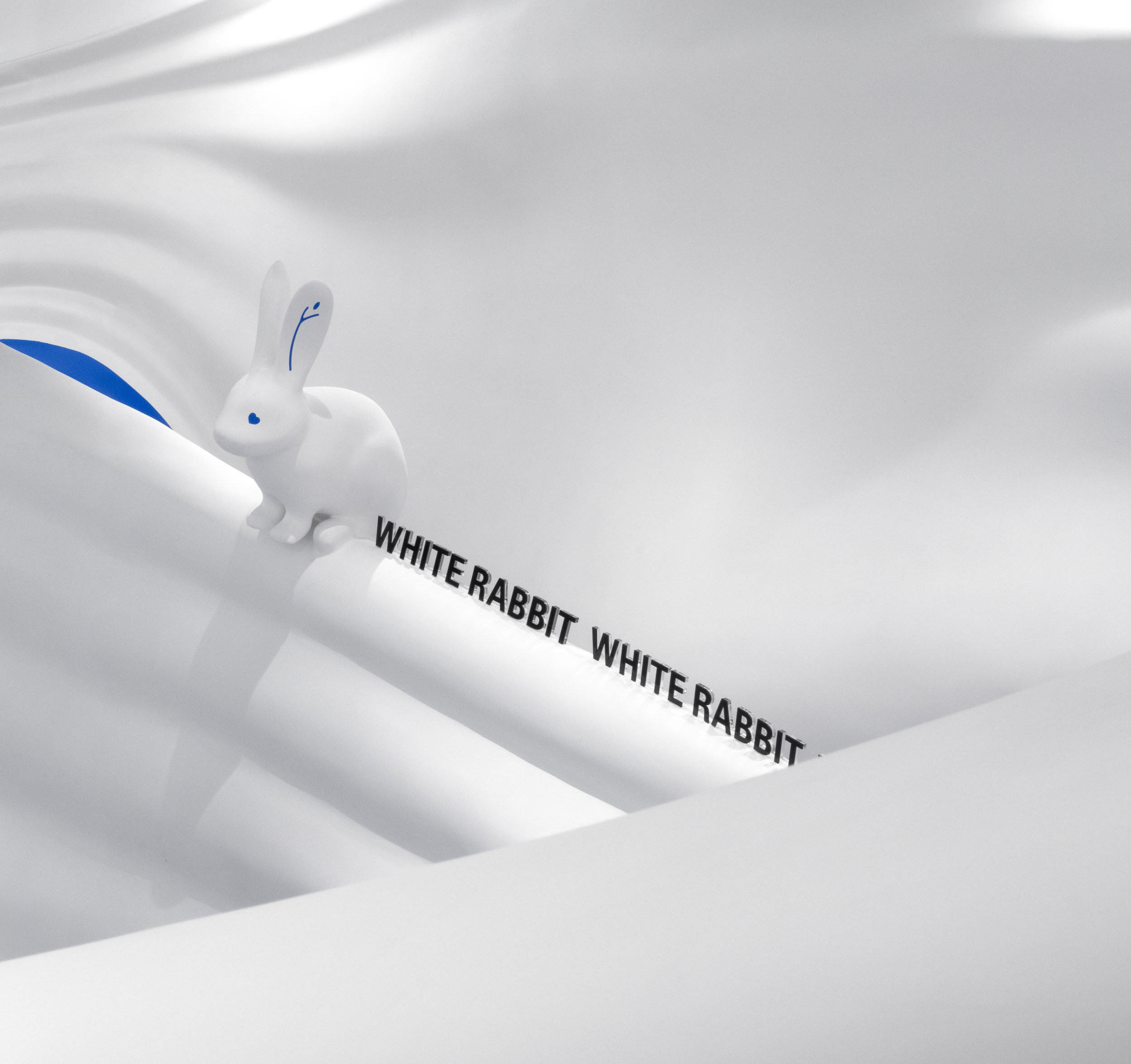
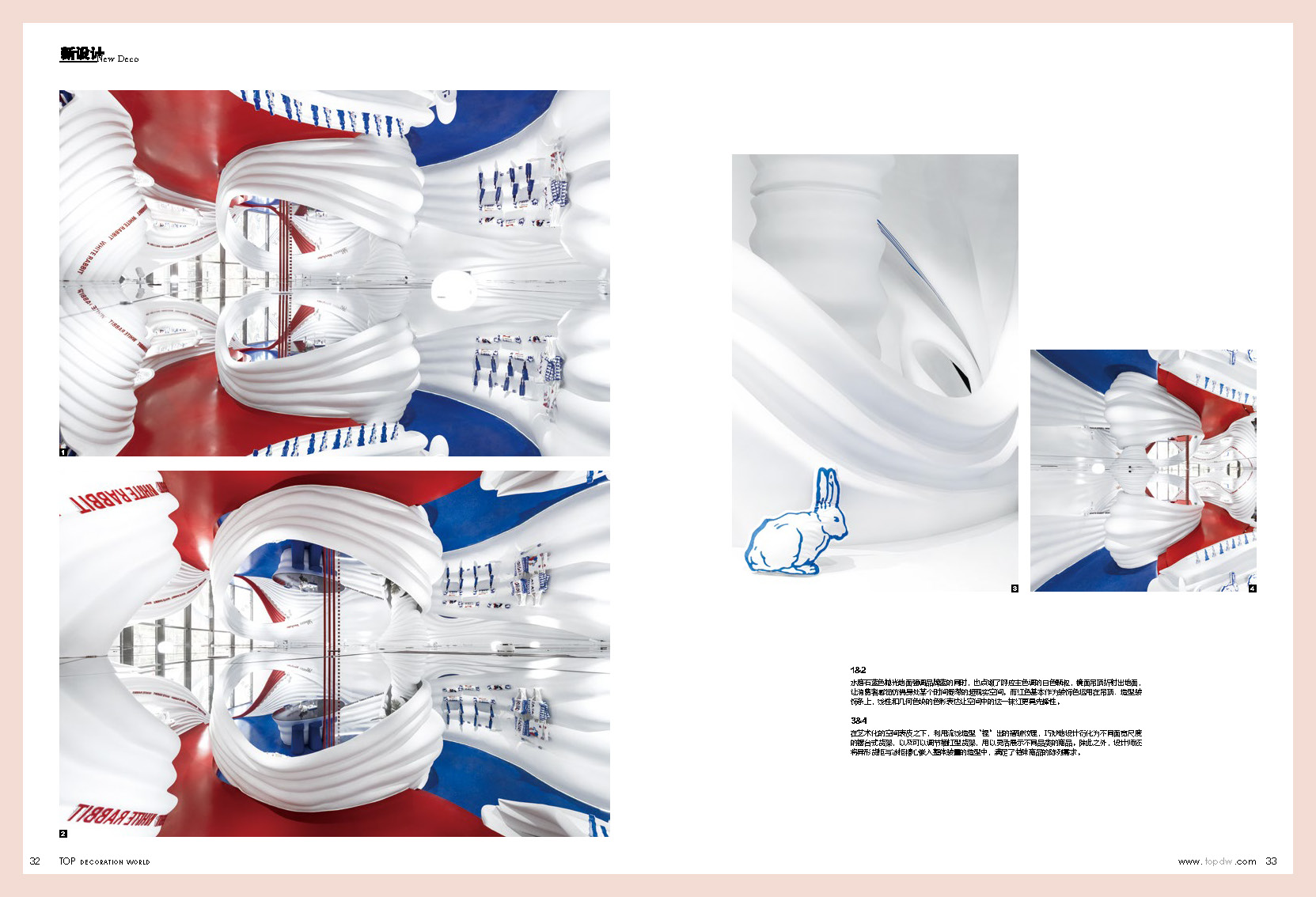
Using the brand wrappers as an experimental sample, the designer extract the brand-related graphic and textual elements and give them functional meaning, cleverly blending all elements into the existence of the overall installation, providing the convenience of functional usage while increasing the details refinement. The rabbit-shape decorative lace evolves into a top-hung shelf for subsequent operations to exhibit recommended products or star products. The decorative strip inspired by the tear line guides the route for consumer exploration and adds interest to the space. The drawing board table and resting seat, which are integrated with the shape of the installation, meet different functional needs of consumers and are also interesting and witty design applications.
The seemingly random shape of the overall installation actually has a carefully planned layout, so as to stretch and extend the consumer's wandering path. Following the boundaries laid out by the designer, the changes of the exhibit forms guide the consumer's spontaneous activity and a rich relationship and interaction between people and space is therefore created.
The color scheme of the space is extremely concise, using only the brand colors "red, white and blue" in general. The designer's precise control of color combination finally portrays the space as a-bit-luxurious style with a sense of ritual. The large area of pure white color makes the shape of the "installation" appear transparent and dynamic. The polished blue terrazzo floor resonates the brand color blue while also embellishes with white particles echoing the main color. The mirror ceiling reflects the ground, making consumers feel as if they are in some surreal space frozen in time. The red color is basically used as a decorative color on the pendants and decorative strips, in the forms of lines and geometric figures, making it seems more avant-garde in the space.
The idea of rejecting normal shop window opens up the interconnection between the internal and external landscape. Through the designer's artistic construction, the architectural symbols are strengthened, and the sensory impact when stepping into or viewing the space is amplified, forming a memory point for consumers, and invariably highlighting the cultural value of the brand. The design of the White Rabbit Global Flagship Store is a rational construction under a wild shape, an experimental blueprint of art intervention in commerce, and a design challenge that contains complexity in simplicity. It not only revolutionizes consumers' ordinary imagination of commercial space, but also resembles a discussion on the service attributes of future consumption places. It dissolves the boundary between art and commerce, provides an immersive spatial experience, and uses design to reach the deeper artistry of space.


The White Rabbit Global Flagship Store locates at the JKS Arts and Cultural Center, famed as “the first forest theater” in Fengxian district of Shanghai. The designer was invited to reorganize and rethink the spatial experience and visual design for this national brand with 60 years of history, connecting memories of three generation ranging from the 1970s, 1980s to the 1990s.
As a long-established brand, White Rabbit has been adhering to its business philosophy of embracing constant changes in line with the rapid development of modern business. While maintaining good memories and keeping pace with the times, White Rabbit, titled as “guochao”, or Chinese fad, has forged numerous cross-border cooperation recent years. All these efforts have prompted its successful transformation. And, this triggered the designer’s thinking.
The designer hopes to weaken the commercial conspicuousness of the project with a surreal artistic scene, focusing on strengthening the terminal visual impression of the brand and creating a brand culture communication channel with scenario-based experience. This newborn global flagship store will preserve the essence of the brand, which has lasted for more than half a century, while reflecting the brand spirit and novel attitude of continuous breakthrough and creative integration.
This is also in line with the business vision of the Arts Center where the project is located - to create an art center for the future. The completion of the project will not only make the flagship store a major attraction in the landmark art center, but also provide citizens with a beautiful imagination of the future artistic lifestyle in the community.
The concept is like a dreamy fairy tale. The designer boldly breaks through the original layout and traditional retail store design ideas, turning the entire space into a large artistic installation. Within the 200 square meters space, the 3D-printed streamline shape simulates the flow of milk, which is an artistic abstract expression to humorously narrate the production process: the seemingly enchanted flowing milk in the air eventually turns into creamy candies on the shelf. The walls facing the walkway are all floor-to-ceiling glass, so that overall design of the store is clearly visible to people outside the store. The illustration-style green plants and the brand mascot rabbit on the window sticker adds a touch of mysterious storytelling to the whole space, as if falling down a rabbit hole and entering a sweet and pure white whirlpool by accident. The spherical lights dotted irregularly in the room, haloed with a shimmering light, and rendered a surreal magic filter for the space, producing more narrative tension and emotion resonance.
Behind the artistic space, the designer also uses meticulous strategic thinking to make it the best in function integration and diversity of multifunctional shelves. The pleated texture “pinched” using streamline shape is cleverly evolved into different sizes of shelves and adjustable bar shelves to flexibly display different types of products. In addition, the designer also carefully embeds shaped cabinets and freezers into the overall installation to meet the needs of special merchandise display.
Using the brand wrappers as an experimental sample, the designer extract the brand-related graphic and textual elements and give them functional meaning, cleverly blending all elements into the existence of the overall installation, providing the convenience of functional usage while increasing the details refinement. The rabbit-shape decorative lace evolves into a top-hung shelf for subsequent operations to exhibit recommended products or star products. The decorative strip inspired by the tear line guides the route for consumer exploration and adds interest to the space. The drawing board table and resting seat, which are integrated with the shape of the installation, meet different functional needs of consumers and are also interesting and witty design applications.
The seemingly random shape of the overall installation actually has a carefully planned layout, so as to stretch and extend the consumer's wandering path. Following the boundaries laid out by the designer, the changes of the exhibit forms guide the consumer's spontaneous activity and a rich relationship and interaction between people and space is therefore created.
The color scheme of the space is extremely concise, using only the brand colors "red, white and blue" in general. The designer's precise control of color combination finally portrays the space as a-bit-luxurious style with a sense of ritual. The large area of pure white color makes the shape of the "installation" appear transparent and dynamic. The polished blue terrazzo floor resonates the brand color blue while also embellishes with white particles echoing the main color. The mirror ceiling reflects the ground, making consumers feel as if they are in some surreal space frozen in time. The red color is basically used as a decorative color on the pendants and decorative strips, in the forms of lines and geometric figures, making it seems more avant-garde in the space.
The idea of rejecting normal shop window opens up the interconnection between the internal and external landscape. Through the designer's artistic construction, the architectural symbols are strengthened, and the sensory impact when stepping into or viewing the space is amplified, forming a memory point for consumers, and invariably highlighting the cultural value of the brand. The design of the White Rabbit Global Flagship Store is a rational construction under a wild shape, an experimental blueprint of art intervention in commerce, and a design challenge that contains complexity in simplicity. It not only revolutionizes consumers' ordinary imagination of commercial space, but also resembles a discussion on the service attributes of future consumption places. It dissolves the boundary between art and commerce, provides an immersive spatial experience, and uses design to reach the deeper artistry of space.