Xiaofangniu Restaurant adopts a bright orange-red paired with white as its primary color scheme. The irregular patterns, resembling the free splashes of cowhide textures, naturally align with the brand name, creating a visually interesting effect while also cleverly defining different areas. The woven shapes of the artistic lighting fixtures serve as spatial “seasonings,” adding a touch of warmth to the dining experience and subtly integrating with the restaurant's signature service in an engaging manner.
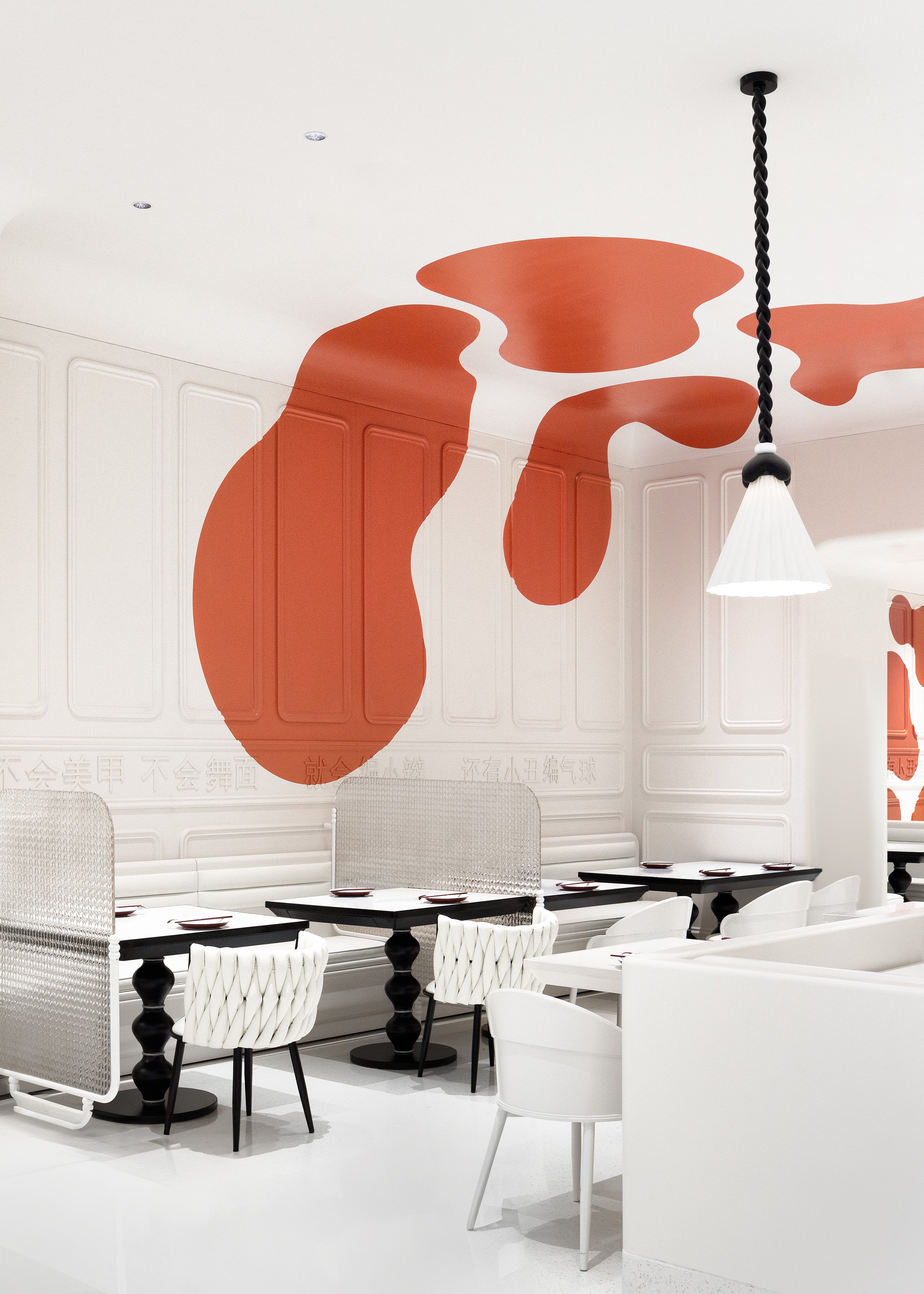
Under soft lighting, the bright and spacious framework complements the warm and graceful colors, together creating a romantic and cozy dining atmosphere for patrons. The simple yet elegant design approach crafts a dining environment rich in fashionable and artistic appeal.

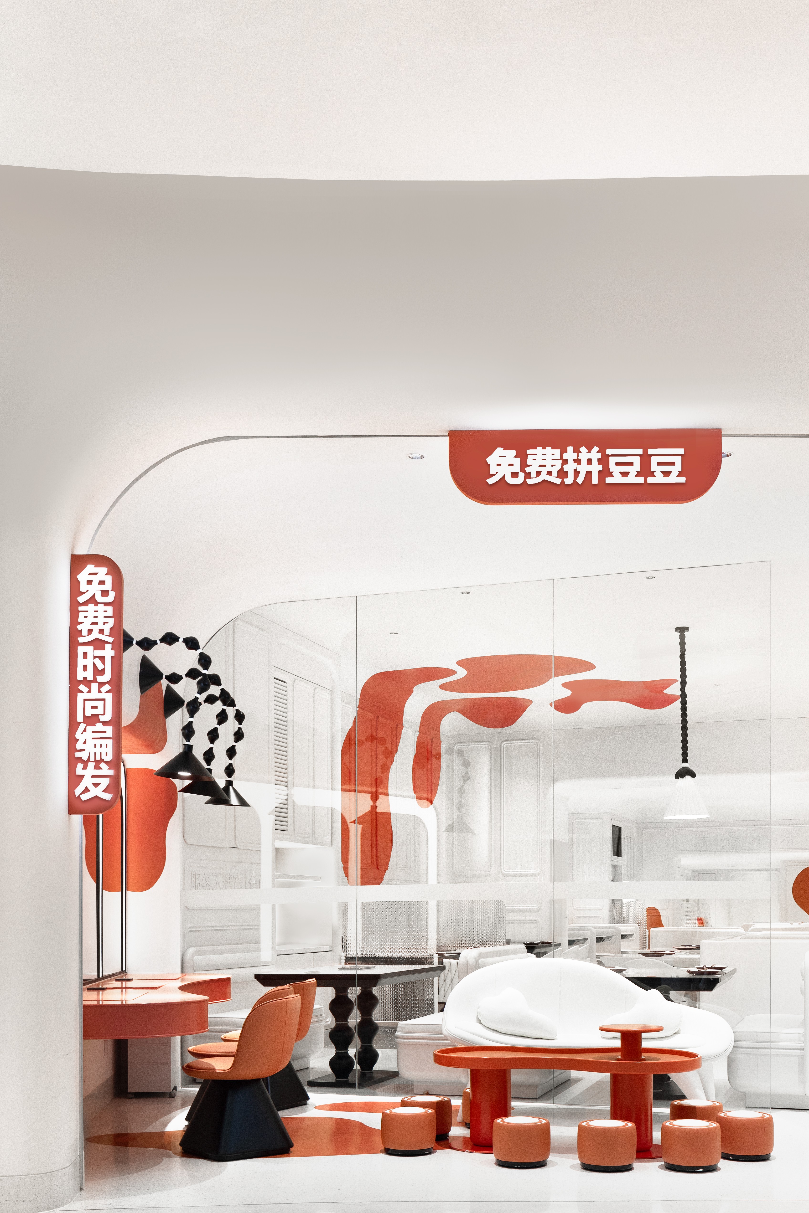
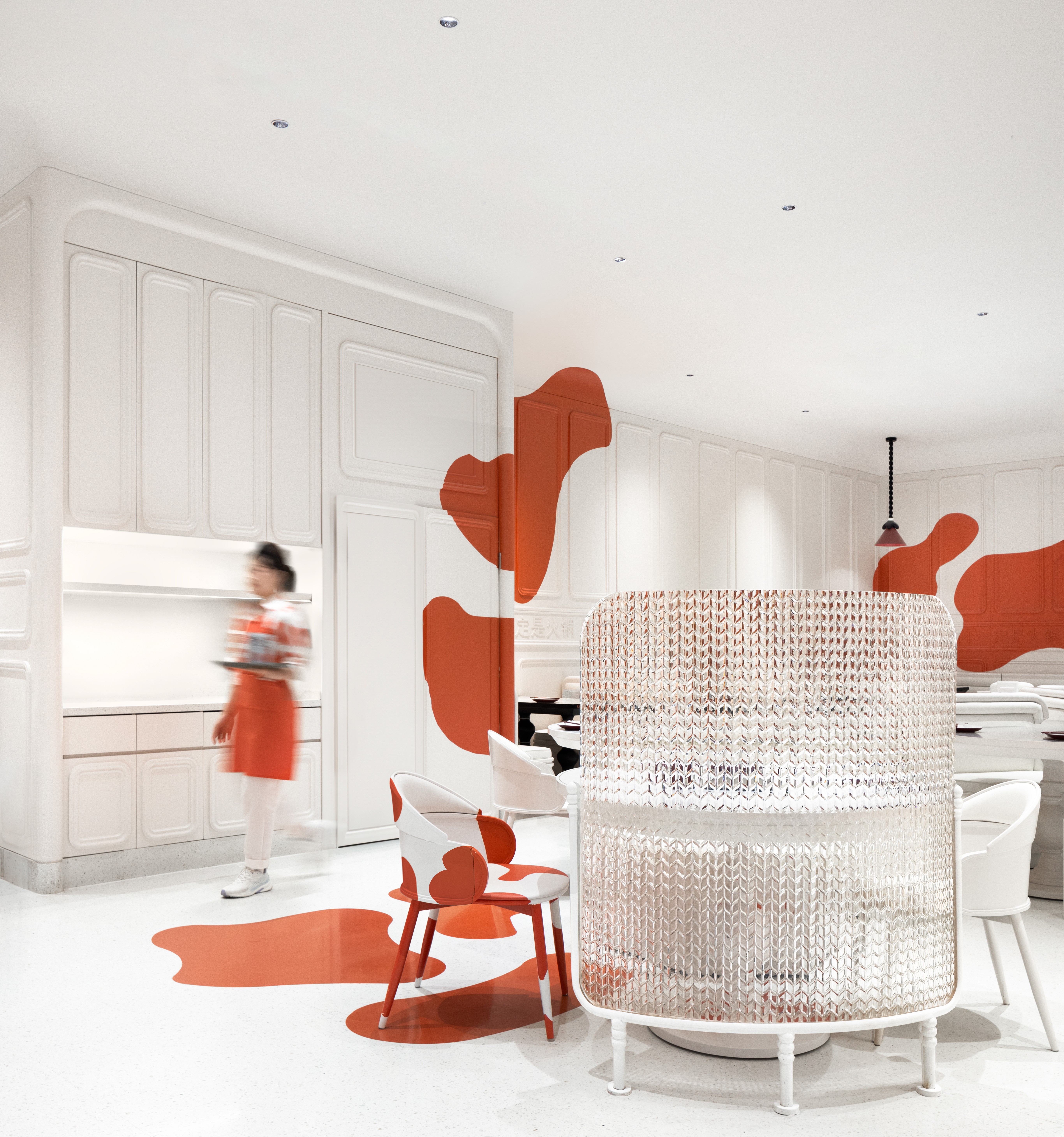
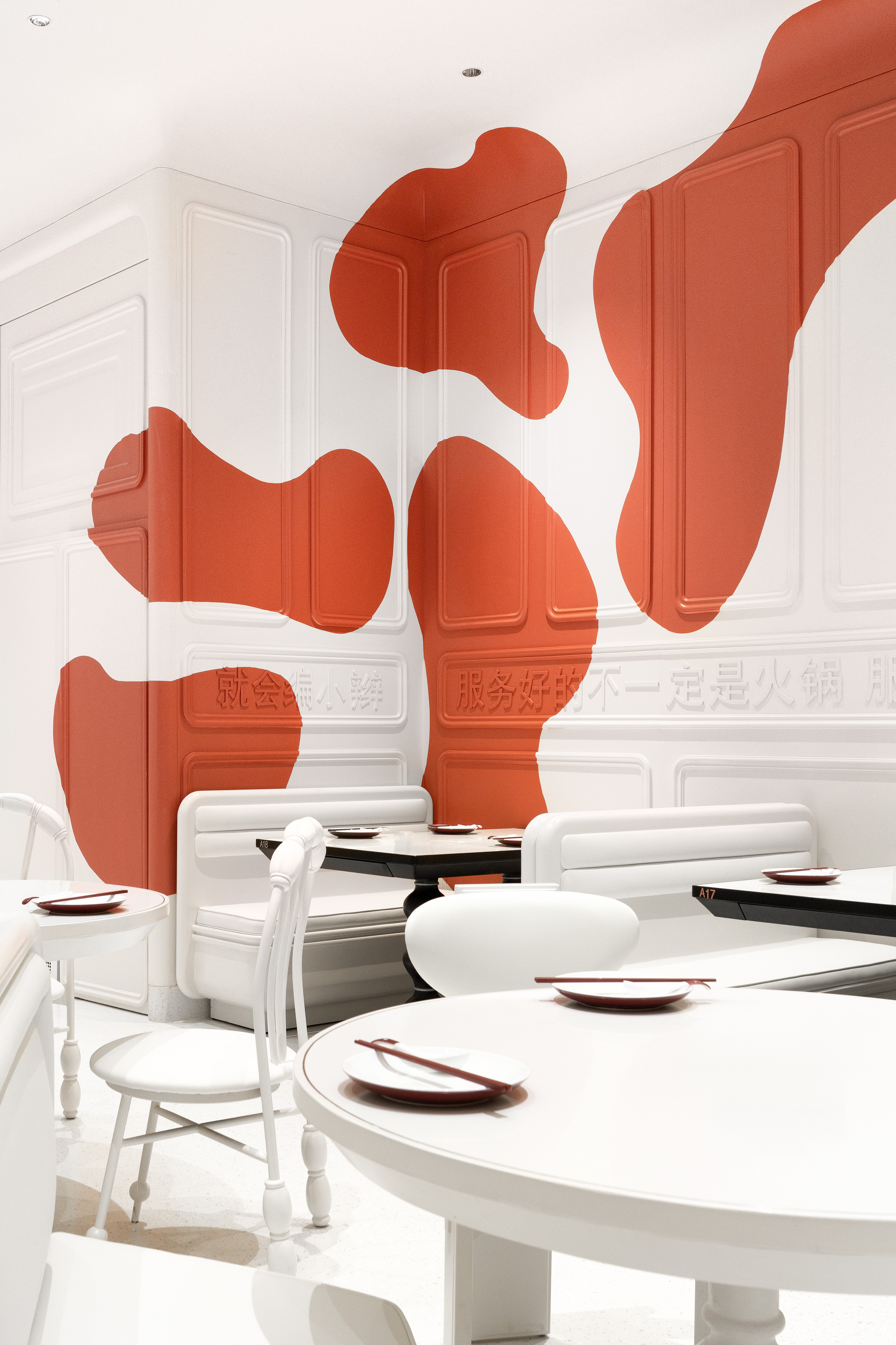
Xiaofangniu Restaurant adopts a bright orange-red paired with white as its primary color scheme. The irregular patterns, resembling the free splashes of cowhide textures, naturally align with the brand name, creating a visually interesting effect while also cleverly defining different areas. The woven shapes of the artistic lighting fixtures serve as spatial “seasonings,” adding a touch of warmth to the dining experience and subtly integrating with the restaurant's signature service in an engaging manner.
Under soft lighting, the bright and spacious framework complements the warm and graceful colors, together creating a romantic and cozy dining atmosphere for patrons. The simple yet elegant design approach crafts a dining environment rich in fashionable and artistic appeal.